Appearance
什么是 BFC?BFC 有什么作用?
1.BFC 概念
块格式化上下文(Block Formatting Context , BFC) 是 Web 页面的可视化 css 渲染的一部分,是块盒子的布局过程发生的区域,也是浮动元素与其他元素交互的区域。(在 BFC 内部,块级元素的布局、浮动元素与其他元素的相互作用,会受到 BFC 规则的影响)
- BFC(block formatting context)块级格式化上下文,他是页面中的一块渲染区域,并且有一套属于自己的渲染规则,他决定了元素如何对齐内容进行布局,以及与其他元素的关系和相互作用。当涉及到可视化布局的时候,BFC 提供了一个环境,HTML 元素在这个环境中按照一定规则进行布局;
- BFC 是一个独立的布局环境,具有 BFC 特性的元素可以看作是隔离的独立容器,容器里面的元素不会在布局上影响到外面的元素。
BFC(Block Formatting Context)是 Web 页面中的一个独立渲染区域,具有自己的渲染规则,会影响元素的布局方式并隔离元素。主要的作用就是解决布局问题。
2.BFC 的布局规则
- 内部的盒子会在垂直方向,一个个地放置,每个块元素独占一行。
- 盒子垂直方向的距离由
margin决定,属于同一个 BFC 的两个相邻Box的上下margin会发生重叠。 - 每个元素的左边,与包含的盒子的左边相接触,即使存在浮动也是如此。
- BFC 的区域不会与
float box重叠。 - BFC 就是页面上的一个隔离的独立容器,容器里面的子元素不会影响到外面的元素,反之也如此。
- 计算 BFC 的高度时,浮动元素也参与计算。
3.形成 BFC 的条件
float属性不为noneoverflow为auto、scroll、hiddendisplay为inline-block、table-cell、table-caption、flex、inline-flex中的任何一个position为absolute或fixed
4.BFC 的使用场景
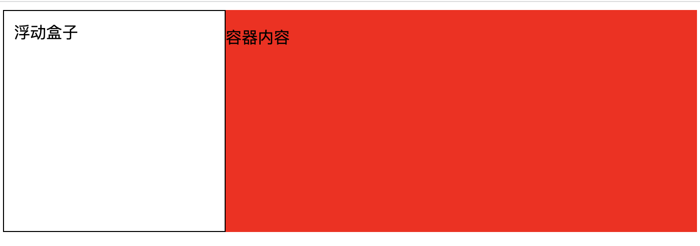
1).如何让浮动元素和周围的内容等高?
html
<style>
  /*
      float + display + overflow + position
      1.float: right | left;   父元增添浮动后,仍然要清除浮动
      2.display:inline-block | tabel-cell | table-caption 等更改容器格式不推荐
      3.position:absolute | fixed 更改布局方式不推荐
      4.overflow: auto | scroll | hidden
      > overflow:hidden 额外的影响相对较少
    */
  .box {
    background: red;
    /* overflow:hidden 即可 */
  }
  .float {
    width: 200px;
    height: 200px;
    background: white;
    border: 1px solid black;
    padding: 10px;
    float: left;
  }
</style>
<div class="box">
  <!--  问题在于:未计算浮动元素的高度。让父容器变成BFC即可 -->
  <div class="float">浮动盒子</div>
  <p>容器内容</p>
</div><style>
/*
float + display + overflow + position
1.float: right | left; 父元增添浮动后,仍然要清除浮动
2.display:inline-block | tabel-cell | table-caption 等更改容器格式不推荐
3.position:absolute | fixed 更改布局方式不推荐
4.overflow: auto | scroll | hidden
> overflow:hidden 额外的影响相对较少
*/
.box {
background: red;
/* overflow:hidden 即可 */
}
.float {
width: 200px;
height: 200px;
background: white;
border: 1px solid black;
padding: 10px;
float: left;
}
</style>
<div class="box">
<!-- 问题在于:未计算浮动元素的高度。让父容器变成BFC即可 -->
<div class="float">浮动盒子</div>
<p>容器内容</p>
</div>2).如何解决垂直方向 margin 合并问题?
同一个 BFC 的两个相邻
Box的上下margin会发生重叠。
html
<style>
    .block1 {
      width: 200px;
      height: 200px;
      background: blue;
      margin-bottom: 20px;
    }
    .block2 {
      width: 200px;
      height: 200px;
      background: blue;
      margin-top: 40px;
    }
  </style>
</head>
<body>
  <div class="block1">第一个块级元素</div>
  <div class="block2">第二个块级元素</div>
</body><style>
.block1 {
width: 200px;
height: 200px;
background: blue;
margin-bottom: 20px;
}
.block2 {
width: 200px;
height: 200px;
background: blue;
margin-top: 40px;
}
</style>
</head>
<body>
<div class="block1">第一个块级元素</div>
<div class="block2">第二个块级元素</div>
</body>将两个块元素隔开,可以得到
margin的正常解析添加父元素包裹下方元素
- 为父元素增添边框,可以阻止
margin溢出,缺点就是多了个边框。
html<div class="block1">第一个块级元素</div> <div class="parent" style="border-top: 1px solid transparent"> <div class="block2">第二个块级元素</div> </div><div class="block1">第一个块级元素</div> <div class="parent" style="border-top: 1px solid transparent"> <div class="block2">第二个块级元素</div> </div>为父元素设置 padding 代替子元素 margin
css.block2 { width: 200px; height: 200px; background: yellow; } .parent { padding-top: 100px; }.block2 { width: 200px; height: 200px; background: yellow; } .parent { padding-top: 100px; }为父元素设置 overflow:hidden 属性,产生 BFC,缺点是如果子元素有定位可能会被 hidden 掉
html<div class="block1">第一个块级元素</div> <div class="parent" style="overflow: hidden"> <div class="block2">第二个块级元素</div> </div><div class="block1">第一个块级元素</div> <div class="parent" style="overflow: hidden"> <div class="block2">第二个块级元素</div> </div>通过伪类增添平级的 BFC 渲染区域,通过 BFC 进行隔离
css.parent::before { content: ""; display: table; }.parent::before { content: ""; display: table; }
- 为父元素增添边框,可以阻止
以上方式同样可以解决垂直方向 margin 溢出问题。
3).如何实现自适应的两列布局?
BFC 的区域内的元素不会与
float box重叠。html<style> /* 1.层叠上下文,层叠顺序,浮动 > 块元素 2.浮动后形成BFC,外部元素无法进入BFC区域,浮动后则是两列布局。 */ .aside { width: 100px; height: 150px; background: pink; float: left; } .main { height: 200px; background: red; } </style> </head> <body> <div class="aside">菜单</div> <div class="main">内容</div> </body><style> /* 1.层叠上下文,层叠顺序,浮动 > 块元素 2.浮动后形成BFC,外部元素无法进入BFC区域,浮动后则是两列布局。 */ .aside { width: 100px; height: 150px; background: pink; float: left; } .main { height: 200px; background: red; } </style> </head> <body> <div class="aside">菜单</div> <div class="main">内容</div> </body>利用 float 的元素不能进入 BFC 区域的特点
html<style> /* 1.层叠上下文,层叠顺序,浮动 > 块元素 2.BFC的区域不会与 float box 重叠。 */ .aside { width: 100px; height: 150px; background: pink; float: left; } .main { height: 200px; background: red; overflow: hidden; } </style> <body> <div class="aside">菜单</div> <div class="main">内容</div> <!-- 右边元素overflow:hidden后,形成BFC区域,左边的float元素就不能进入右边范围了 --> </body><style> /* 1.层叠上下文,层叠顺序,浮动 > 块元素 2.BFC的区域不会与 float box 重叠。 */ .aside { width: 100px; height: 150px; background: pink; float: left; } .main { height: 200px; background: red; overflow: hidden; } </style> <body> <div class="aside">菜单</div> <div class="main">内容</div> <!-- 右边元素overflow:hidden后,形成BFC区域,左边的float元素就不能进入右边范围了 --> </body>
4).如何防止高度坍塌?
当父级高度消失时,初学者的第一反应就是给父元素设置固定高度,这个是不正确的思路 ❌ 父元素高度应由内容撑起,我们是很难提前确定父元素的高度的。
html
<style>
  header,
  footer {
    background: red;
    height: 60px;
  }
  .main-left {
    background: yellow;
    width: 300px;
    height: 300px;
    float: left;
  }
  .main-right {
    background: orange;
    width: 300px;
    height: 300px;
    float: right;
  }
</style>
<div>
  <header>头部</header>
  <div class="main-left">左侧</div>
  <div class="main-right">左侧</div>
  <footer>底部</footer>
</div><style>
header,
footer {
background: red;
height: 60px;
}
.main-left {
background: yellow;
width: 300px;
height: 300px;
float: left;
}
.main-right {
background: orange;
width: 300px;
height: 300px;
float: right;
}
</style>
<div>
<header>头部</header>
<div class="main-left">左侧</div>
<div class="main-right">左侧</div>
<footer>底部</footer>
</div>方案 1:为父元素设置
overflow:hidden属性。 (缺陷:如果子元素有定位可能会被 hidden 掉)html<header>头部</header> <!-- 创建BFC区域,计算 BFC 的高度时,浮动元素也参与计算。 --> <div style="overflow: hidden"> <div class="main-left">左侧</div> <div class="main-right">左侧</div> </div> <footer>底部</footer><header>头部</header> <!-- 创建BFC区域,计算 BFC 的高度时,浮动元素也参与计算。 --> <div style="overflow: hidden"> <div class="main-left">左侧</div> <div class="main-right">左侧</div> </div> <footer>底部</footer>方案 2:在父元素的结尾追加一个空子元素(块级元素),并让子元素清除浮动影响。(缺陷:平白无故多出个空元素)
html<header>头部</header> <div> <div class="main-left">左侧</div> <div class="main-right">左侧</div> <!-- 利用 clear:both 属性和父元素必须包含非浮动元素两个原理 --> <div style="clear: both"></div> </div> <footer>底部</footer><header>头部</header> <div> <div class="main-left">左侧</div> <div class="main-right">左侧</div> <!-- 利用 clear:both 属性和父元素必须包含非浮动元素两个原理 --> <div style="clear: both"></div> </div> <footer>底部</footer>完美解决方案:为父元素末尾伪元素设置
clear:bothcss.after::after { display: table; content: ""; height: 0; clear: both; }.after::after { display: table; content: ""; height: 0; clear: both; }html<div class="after"> <div class="main-left">左侧</div> <div class="main-right">左侧</div> <!-- 利用 clear:both 属性和父元素必须包含非浮动元素两个原理 --> </div><div class="after"> <div class="main-left">左侧</div> <div class="main-right">左侧</div> <!-- 利用 clear:both 属性和父元素必须包含非浮动元素两个原理 --> </div>